Cliff’s Rocks Our World
Confession: I still sometimes call it “Uncle Cliff’s,” which is what Albuquerque’s premiere amusement park was known as when I used to nag my parents to take me there. It made for a nice, rhythmic, nag-chant – “Un-cle-CLIFF’S!, Un-cle-CLIFF’S!, Un-cle-CLIFF’S!…” (Repeat until parent relents or explodes. Either way, guaranteed entertainment.)
So You Wanna Be a Rock and Roll Star
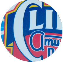
Soon after the “Uncle” was dropped from its name, Cliff’s Amusement Park commissioned a new logo from the talented Michael Doret. If his name isn’t familiar to you, his work certainly is. Doret is the lettering guru who created the logos of such well-known entities as 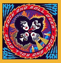 Fuddruckers, the New York Knicks, and Universal Studios Hollywood. And for you headbangers out there, he also designed this album cover for KISS, among many other stellar works in the music and sports industries.
Now for typography nerds like us here at Alphaquerque City Hall, having a rock star like Doret craft a logo for a local enterprise is kind of like finding out that your sister is married to George Clooney. So it is no bold claim to state that this may be one of the best local logo designs to grace our fair city.
Like much of his other work, Doret’s logo for Cliff’s digs deep into the nearly lost art of the hand-painted sign. This logo harkens back to a day when carnivals traveled from town to town and advertised themselves with large, colorful canvas tent panels, using vivid figures, fluid shapes and a variety of elaborate swooping letterforms to attract your eye.
Thrills! Spills! Flared Serifs!
Just look at that gigantic maw of a “C,” preparing to devour every other character in the mark like so much cotton candy. It anchors the entire composition. The diverse letter styles of each individual word suggest the broad range of thrills that lay beyond the ticket booth. “Cliff’s” is rendered on a roller-coaster baseline in bold capitals with gently flared-serifs; “Amusement” is styled in neon-tube monoline script and “Park” fills out the foundation in a heavy, streamlined sans serif that is built like a bumper car. The aerodynamic letters of “Est’d 1959” tilt and whirl inside a blue bubble, adding even more motion and fun.
The whole thing wraps up in a kid-friendly color palette that seems to change from season to season, showing off its versatility. The only thing that would make this mark better would be see it constructed – as large as possible – in buzzing, glowing neon.
I can see it now, blinking on and off: “CLIFF’S… CLIFF’S… CLIFF’S…”