
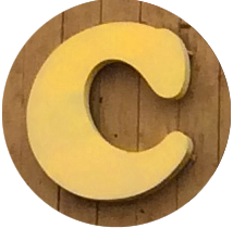
The Cooperage: What’s in a Name?
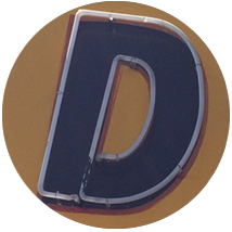
There’s a lot to consider when you pick a typeface to represent your company. In addition to the visual elements like line, weight and shape, you might also want to consider contextual elements like historical or cultural references. Then again, sometimes just the name of the typeface is enough to get the gig, as I suspect is what happened in the case of The Cooperage and its choice of Cooper Black for its wordmark. Hangin’ with Mr. Cooper The Cooperage […]
Read more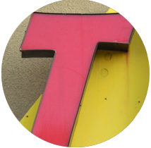
C’mon Baby, Let’s Do the Twisters
In 1987, Albuquerque experienced a rare weather phenomenon for this area: a tornado. This was no over-hyped dust devil, but real honest-to-goodness twister, complete with uprooted trees and damaged buildings but (fortunately) no loss of life. Now we have Twisters all over the place. Not the cyclone kind, but the burrito kind. (My weekend is not complete without the No. 4 with red chile.) Holy Ad Lib!!! The typeface in the Twisters logo is a perfect analogy of the 1987 […]
Read moreWelcome to Alphaquerque
As you drive, bike or walk around any city in America, you’re going to be overwhelmed by typography. Giant letters looming large on storefront signs, billboards, posters, flyers, bumper stickers and so on. We call this environment the typescape. And in this respect, Albuquerque is not much different from any other large American city. What does make us different, though, are the occasionally unique gems of letterforms and logos that you’ll only find here. As we slog our way through […]
Read more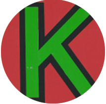
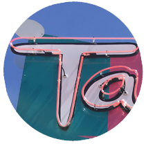
Kellys Kicks on Route 66
Some of my favorite graphic design taps into easily recognizable cultural elements that give an identity context, or at least a point of reference. Kellys Brew Pub, housed in the former Jones Motor Company building on historic Route 66, has chosen to honor the legacy of the location with a nostalgic nod to a recognizable roadside sight. A Star is Born The Kellys sign draws its inspiration from the old familiar the Texaco station. Signs heralding Texaco (an abbreviation for […]
Read more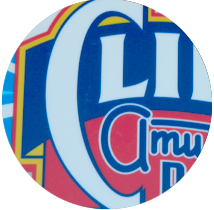
Cliff’s Rocks Our World
Confession: I still sometimes call it “Uncle Cliff’s,” which is what Albuquerque’s premiere amusement park was known as when I used to nag my parents to take me there. It made for a nice, rhythmic, nag-chant – “Un-cle-CLIFF’S!, Un-cle-CLIFF’S!, Un-cle-CLIFF’S!…” (Repeat until parent relents or explodes. Either way, guaranteed entertainment.) So You Wanna Be a Rock and Roll Star Soon after the “Uncle” was dropped from its name, Cliff’s Amusement Park commissioned a new logo from the talented Michael Doret. […]
Read more
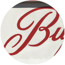
Dion’s Pizza: A Tour of Greece, Italy and Sweden
Dion’s is an Alphaquerque institution. The signage features a smiling pizza chef rendered in a woodcut engraving that would make Dürer himself hungry for a slice with pepperoni and olives. These guys make a pretty good pizza, especially for a place that started out as a Greek restaurant. Seriously, you don’t know how close you came to reading about a place named after Dionysus, the Greek god of wine and merrymaking. International Flavor This logo is an international smorgasbord: a […]
Read more
The Many Faces of Blake’s Lotaburger
When I was a kid, it was just “Lotaburger,” no “Blake’s”. It was one of our neighborhood hangouts, across from the high school. There was no indoor dining area. You either sat in your car, on your car, or on the massive concrete tables in the shade under the metal canopy while you waited for your number to be called. “Number 52. 52, please!” Cracking the Code We were lucky. My best friend’s mom worked a split shift at our […]
Read more