Designer’s View: Jaynes and the Jilted Ligature

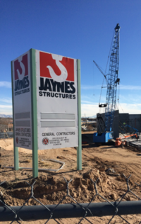
Editor’s Note: You can’t drive around Albuquerque for very long without seeing a job site sign or a work truck adorned with the Jaynes logo. I have always liked the stark simplicity of this logo. The crane hook knocking out of a bold red rectangle resting on a foundation of a bold wordmark makes a perfect icon for a construction company.
So it is a special treat to learn the history of this mark directly from the designer who created it, Dean Gianopoulos. These days, Dean is the owner of Accord Creative, a creative services company. But some 30-odd years ago, Dean was a designer at Rick Johnson & Company, one of Albuquerque’s most storied design and advertising firms.
So without further ado, here is the story of the Jaynes logo, straight from the source.
Jaynes and the Jilted Ligature
Contributed by Dean Gianopoulos
The old “ribbon” Jaynes logo
Jaynes Corporation became a client of the Rick Johnson & Company ad agency in the mid-1980s. Jaynes was in need of a modern logo design badly, as the decades-old company identity to that point (lots of words in an ambiguous flowing ribbon shape) was likely the work of a 1940s sign painter. Rick Johnson employed a handful of designers including myself; all of us happily went right to work on new designs.
 Trying to conjure a simple shape to convey the ideas of size and strength, I thought about large construction equipment and it wasn’t long before the J-shaped hook tethered to a crane came to mind. Construction is full of immediacy and activity, so wanting to impart the action of the hook led me to overlap the J-shape monogram on top of the typography. For the name Jaynes, I needed a heavy font with absolutely no frills; Futura Extra Bold Condensed was available from Letraset and fit the requirements better than any other sans serif. The late 1970s and 80s were the days of super-tightly kerned lettering in logos and ad headlines, so smashing together the letters in Jaynes just seemed to make the finished logo more modern and powerful.
The CEO of Jaynes at the time was J. Howard Mock. Howard is an Albuquerque construction and real estate icon and a genuinely great fellow. Going into the client presentation I figured the design was a winner; it most certainly hit the nail squarely on the head. When I revealed the logo, Howard thought for a moment and said, “I’m sorry, we can’t use that.” I’m pretty sure my jaw made a sound when it hit the table. When asked why it wouldn’t work, Howard squirmed a little and finally blurted, “The guys in the industry will call me Captain Hook!”
It took a week or two for Howard to accept the logo, but during that time everyone at Jaynes looked at the design a little too hard. The original typography made use of a ligature (overlapping the N and E) which made the word Jaynes slightly larger proportionately and easier to read. Word came back that they didn’t like the ligature and would actually reject the entire design unless each letter was shown in full. Part of the appeal of the original is in the play of all the differently angled negative shapes in the letters; this integrity is confounded by the thin, perfectly vertical white line in what became the approved design. This is a concession that still rankles me a bit to this day.
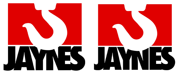
The original design, left, included a ligature of the N and E. The modified version, right, is still in use today.
To Howard’s credit, he ordered all marketing materials immediately; new stationery, new site signs, new truck graphics, transforming the look of the company seemingly overnight. A few months after the introduction of the new Jaynes design, Rick received a letter from Howard, which was shared with the staff. Howard wrote that the reception of the new logo was very positive and that awareness of Jaynes as one of the top construction firms in the city had never been higher. Howard graciously thanked us and signed the letter, “Captain Hook.”
I surmise that the Jaynes logo has remained relevant and in use for so many decades because it is difficult to conceive of another design that would convey more power and awareness in as simple a package.
Back to the Futura
Editor’s note: As Dean mentions above, the type is set in a tightly-kerned Futura Extra Bold Condensed, a typeface that nearly became a victim of its own popularity. A tongue-in-cheek campaign entitled Art Directors Against Futura Extra Bold Condensed was launched in the early 1990s. (It didn’t work.)
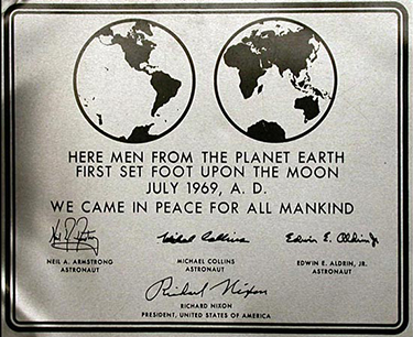
Apollo 11 commemorative plaque set in Futura. NASA image.
Futura Extra Bold Condensed is a member of the Futura family of typefaces, created by German designer Paul Renner in 1927. Influenced by the sensibilities of the Bauhaus, Renner opted to design a new, modern typeface based on geometric forms. Futura’s characters derive from perfect circles, squares and triangles drawn in clean, even strokes.
Futura has proven to be one of the most used and well traveled typefaces of the 20th century. With its German roots, it became the corporate typeface of Volkswagen. It moved north into Sweden to be the type of choice for Ikea for many years (before being jilted for that tramp Verdana.) Its simple clarity made it a popular choice with filmmakers from Stanley Kubrick to Wes Anderson. It even traveled all the way to the moon on a commemorative plaque left behind by the Apollo 11 crew.
Alphaquerque would like thank Dean again for generously sharing his story of one of Albuquerque’s most familiar logos. You can see more of his work at the Accord Creative website.