
Hiland Theater: Neighborhood Movie Haus

I grew up in the shadow of the Hiland theater. Because it was the only theater within walking distance of my house, I probably saw more movies there in my youth than at any other movie house in town. I have a particularly weird memory of my older brother taking me there to see The Exorcist. The couple sitting in the row behind us were high, and when the head-spinning in front of us began, the mind-blowing behind us immediately followed.
Housing the Arts
The Hiland has long since stopped showing movies, but it still is a home to the performing arts. Now it houses the National Dance Institute of New Mexico. The towering signage of geometric capitals still stands like a cultural lighthouse along Central Avenue. Letters structured on simple circles and squares stack vertically and reach high into the sky to give it a monumental quality. The style of those sturdy letters stems from the Bauhaus.
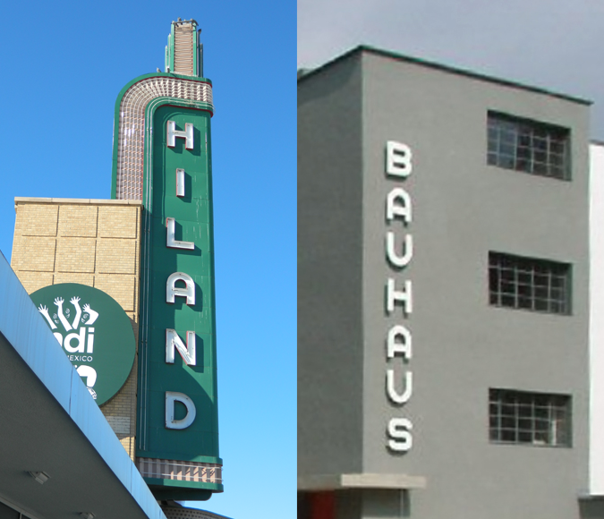
The influence of Bauhaus letterforms is apparent in this comparison of the Hiland Theater and the Bauhaus Dessau building.
Bayer Necessities
The Bauhaus was an art school in interwar Germany that had profound influence on art, design and architecture in the 20th century. Among its faculty were such luminaries as Walter Gropius, Ludwig Mies van der Rohe, and Paul Klee. One of most prolific and influential graphic designers to come out of the Bauhaus was Herbert Bayer.
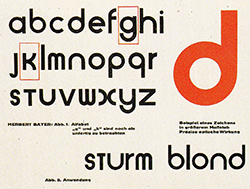
Bayer’s letter designs were often built on the strict geometry of circles and squares.
Bayer began as a student at the Bauhaus and then became a member of the faculty, directing the printing and advertising of the school. Skilled in all areas of design, Bayer was a gifted and revolutionary type designer. In 1925, he proposed a universal typeface, built upon strict geometric forms, that combined capitals and lower-case letters into a unicase format. In Weimar Germany – a country comfortable with Fraktur blackletter – this was radical.
Bayer continued to create innovative typography that was built on the Bauhaus philosophy of functionality and dismissal of ornament. His constructivist letter designs lend themselves well to signage for their clarity and industrial feel. They also lend themselves well to the fabrication of metal channels and neon tubes, perfectly consistent with the Bauhaus aesthetic of form following function, evidenced in the Hiland sign.
It Ain’t Nothin’ but a Bauhaus Party

ITC Bauhaus was used in posters and titles for the film American Hustle to evoke the 1970s, an era of man-perms, wide ties and leisure suits.
This style of lettering went through a renaissance in the 1960s and 70s. Designers began to rebel against the corporate-modernist styles of Swiss design and draw inspiration from early 20th century art movements like Art Nouveau, Art Deco and the Bauhaus. Type designers inspired by Bayer’s geometric forms created Bauhaus-flavored fonts like Blippo, Burko, and of course ITC Bauhaus. Today, we typically associate those typefaces with the grooving ’70s, but their roots actually go back to the roaring ’20s.
I don’t go to many movies anymore, because now we live in an age where the movies come to us. But knowing that the Hiland now serves its community by housing an organization dedicated to the arts seems a fitting tribute to the Bauhaus philosophy.