
Garcia’s – The Pretorian Guard
In the mid-1980s, I worked for a printing company that produced the highly unpopular Door Store Shopper. The Shopper was a weekly publication comprised of ads and coupons that was left on your doorstep whether you wanted it or not. Did I say “publication?” I meant “litter.”
We kept an odd schedule. Ad sales were done during the day, so ad production took place at night. We’d work 4:00pm to midnight all week, except Saturdays, when we had to report for work at 7:00am to make corrections and edits and then consolidate all of the ads onto final layout boards for a noon press run. Those early Saturday mornings would have been hard to face, save for our ritual 6:00am breakfasts at the nearby Garcia’s Kitchen.
A cold Saturday morning in January was the bane of 20-something night-shifters like us. Not asleep, but not awake, we navigated the twilit Central Avenue corridor until we sighted the glowing beacon of the Garcia’s sign, welcoming us in for fresh huevos and hot coffee.
Marching to Pretoria
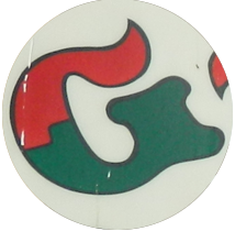
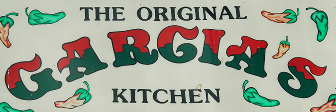
Garcia’s is set on a curved baseline in a fancy typeface called Pretorian. In a nod to our chile choices, the letters are split-colored in red and green. With its wavy strokes and curvy swashes, Pretorian is reflective of both the ornamental excess of the 1880s when it was created as well as the groovy vibe of the 1970s, when Garcia’s Kitchen came into being.
Pretorian is a typeface with an eccentric personality and an exotic charm. It’s like your favorite uncle from the old country (though you have no idea which old country.) Pretorian’s roots appear to be in Victorian England (as it appears in this type specimen sheet from P.M. Shanks and Sons Type Foundry.) Pretorian’s swashy strokes bring to mind letters found in illuminated manuscripts, belle epoque advertising posters and circus sideshow tents. But how did an overwrought typeface from the Age of Empire become so popular during the swinging seventies?
Letra… Set… Go!
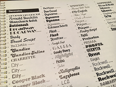
The Decorative Type index page from a Letraset catalog, circa 1981. Pretorian appears alphabetically in the third column.
Pretorian owes its resurgence to a wonderful type product of the 1960s called Letraset. In the days before computers, type was an often expensive commodity for designers. But then along came Letraset, an inexpensive dry-transfer product that provided designers an affordable and expansive library of easy-to-use, rub-down lettering. Letraset’s popularity gave graphic artists of that era freedom to be more experimental with typography, thus creating a demand for more variety. To help meet this demand, Letraset turned revivalist and resurrected a number of typefaces that migrated easily from the Gilded Age to the Atomic Age. Well-thumbed Letraset catalogs were as common a resource as the Yellow Pages (ask your grandparents) and new type designs were as eagerly awaited as the latest Star Wars movie.
By the late 1980s, Letraset sheets had mostly gone the way of the dodo, having been made obsolete by desktop publishing. Happily, the type designs they revived and popularized live on in their digital form. Pretorian survives as well and may well outlive us all as it has even been adopted as the typeface for the ice cream of the future.
Days of Future Past
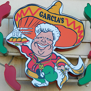
This caricature of founder Andrew Garcia serves as the trade character for the restaurant. Andy sports a gold neck chain, some shiny bling and a sombrero inexplicably adorned with the name set in Cooper Black instead of Pretorian.
A lot of designers my age like to wax rhapsodic about the past. We gather around and share stories about the salad days of Letraset, stat cameras, border tape and hot wax. (I’m guilty of it myself.) But it’s really just so much nostalgic nonsense. In reality, I wouldn’t trade my Adobe Illustrator or Photoshop for a library of Letraset or roomful of Rapidographs. Even though advances in technology have made us (arguably) more productive, we also have been forced to address the issues of skill segmentation, the democratization of design and even the looming death of print.
But some things never change, and I still enjoy the occasional Saturday breakfast at Garcia’s. But I don’t have to be there at 6:00am. They serve breakfast all day.