The Many Faces of Blake’s Lotaburger
When I was a kid, it was just “Lotaburger,” no “Blake’s”. It was one of our neighborhood hangouts, across from the high school. There was no indoor dining area. You either sat in your car, on your car, or on the massive concrete tables in the shade under the metal canopy while you waited for your number to be called. “Number 52. 52, please!”
Cracking the Code
We were lucky. My best friend’s mom worked a split shift at our neighborhood LB, so we could go there after school and order a Lotaburger (cheese, green chile, no lettuce, extra mustard) and a large root beer.
She’d write the order in pencil on the bag your food would eventually be served in. The order was written in a kind of code. A large “1” and then in smaller letters next to it “CH, GC, HL, XM”. Then, below all that a large “RB-L.” It was like watching an ancient Sumerian scribe tally up the day’s grain storage in an unknowable hieroglyphic.
By our junior year, my best friend followed in his mom’s footsteps and graduated from customer to employee himself. He learned the secrets of bag code and fry craft, and like a card trick your uncle taught you, the mystique rapidly faded, and we found ourselves hanging out at other haunts. Usually someplace with a Pac-Man game.
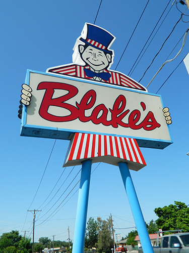 He’s Not Wearing Pants!
While I was away at college, the “Blake’s” man started showing up in the signage. At first I was appalled. Who was this character? He looked like a cross between Uncle Sam and Curious George. Apparently following the lead of Ronald, Wendy and Colonel Sanders, someone decided a trade character and a first name would make the Lotaburger dining experience more personable. And so a beloved Alphaquerque landmark was born.
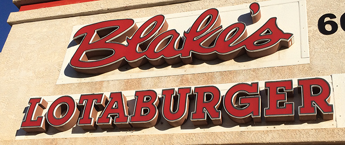
Just like the grinning giant, the Blake’s lettering style on this particular sign has a lot of personality. The example here is a loose script brushstroke of a signature. It’s casual, energetic and friendly.
Blake’s Got a New Face
What is troubling about the Lot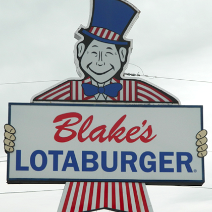 aburger identity is the broad variety of typefaces used by the chain. Newer signs now sport a less energetic rendering of the name in a bland Brush Script, a typeface so overused since its inception in 1942 that it now renders nearly any corporate identity as either generic or ironic. This newer type treatment also reintroduces the word “Lotaburger” back into the signage, in a no-frills sans serif. The sign at left uses Franklin Gothic, but Blake’s likes to give several grotesk-style sans serifs their moment in the sun.
The Blake’s website sports a similar treatment, albeit with a mid-weight Helvetica, which is also used in much of Blake’s print collateral, such as its bags, and print advertising.
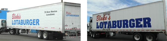
On their livery, Blake’s has used Helvetica’s idiot cousin Arial (below left) as well as the hulk-like slab-serif Aachen (below right) on occasion.
Another slab-serif, Lubalin Graph can be spotted around town for the Lotaburger wordmark.
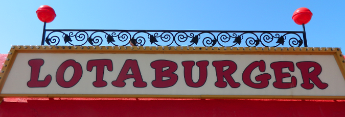
For a more nostalgic look, this throwback slug-serif version still stands at some locations.
Maybe someday all of the Blake’s brand assets will be on the same identity standard, but with nearly 80 locations, it’s a big job. Even for a giant.
Whoops, gotta go. I think they just called my number.