
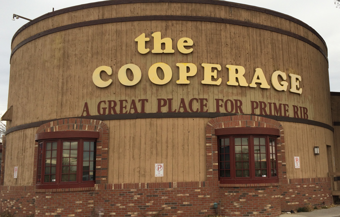
The Cooperage: What’s in a Name?
There’s a lot to consider when you pick a typeface to represent your company. In addition to the visual elements like line, weight and shape, you might also want to consider contextual elements like historical or cultural references.
Then again, sometimes just the name of the typeface is enough to get the gig, as I suspect is what happened in the case of The Cooperage and its choice of Cooper Black for its wordmark.
Hangin’ with Mr. Cooper
The Cooperage is one of those whimsical examples of architecture where the building is disguising itself as something else – in this case, a barrel. A craftsman who forms staves of wood and metal bands into containers for wine, beer, spirits and other goods is known as a “cooper.” It’s one those great words that passed from obsolete occupation to surname, like Smith, Chandler or Wainwright. And one of the people who inherited the Cooper surname was one of the 20th century’s most celebrated type designers, Oswald Bruce Cooper.
The Bold and the Beautiful
Cooper was a calligrapher, designer and ad man who found his true calling as a typographer. The hand lettering he created in his ad designs for companies like Packard and Anheuser-Busch were developed into formal typefaces, most notably Cooper Old Style. Following on the success of these typefaces, Cooper created a heavyweight, round-serif version that he called Cooper Black. It’s a face with a lot of personality. Bold and brassy, funny and friendly; if Amy Schumer was a typeface, she’d be Cooper Black.
Always the ad man, Cooper marketed the new typeface to the “far-sighted printer with near-sighted customers.” The typeface proved extremely popular and spawned many imitators, including Goudy Heavyface, designed by one of Cooper’s former instructors, Frederic Goudy.
Little Deuce Coop(er)
Cooper Black enjoyed a successful run for a few years, but by mid-century, fell out of favor as designers began to opt for the no-nonsense sans-serif faces of the emerging Swiss design style. It wasn’t until the 1960s, when designers rebelled against the establishment by reviving Art Nouveau and Art Deco styles, that Cooper Black found a second life. Albums for bands from the Beach Boys to The Doors indicated the revived appreciation for Oswald Cooper’s most successful typeface.
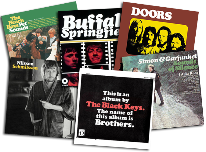
Album sleeve designers of the 1960s revived the use of Cooper Black for groups such as The Beach Boys and Buffalo Springfield. Use of the typeface by The Black Keys shows that Cooper Black continues to exude coolness to this day.
Back in Black

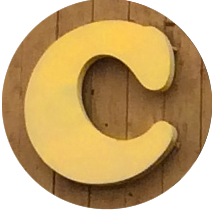
Cooper Black’s lower-case g is one of the most beautifully crafted letters in all of typedom.
In fact, it could be argued that Cooper Black became too popular, being used so extensively as to risk becoming generic. In the 1970s, you couldn’t walk down the street without seeing someone wearing a t-shirt or trucker hat adorned with iron-on Cooper Black letters. But rather than succumb to the excess of success, Cooper Black soldiers on, and is now enjoying a renaissance of sorts, as recent design trends are again opting for the faux-psychedelia of a romanticized Woodstock nostalgia.
Which brings us back to The Cooperage wordmark itself. The type seems an appropriate choice in every aspect. Choosing to set the mark in all caps might increase its boldness, but it’s also a missed opportunity to show off some of the face’s personality by not using the lower-case letters as well, especially the two-story “g,” which is one of more beautiful letters in all of typedom.
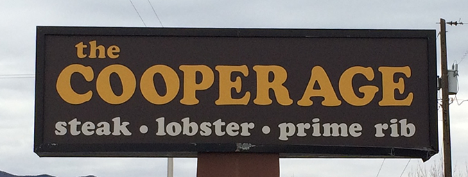
The restaurant makes up for it though, by featuring an all lower-case version on its website. I guess that makes it more “web-friendly.” (Is case sensitivity still an issue? Haven’t we gotten past that yet?) But it does give us a look at some of the nicer letter forms.
I’d be remiss if I didn’t at least mention one of my favorite elements in the Cooperage’s 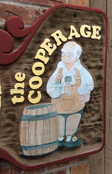 brand, and that is the trade character of The Cooper himself. Mallet in hand, bedecked in the peasant shirt and leather apron of a 18th-century tradesman, The Cooper (does he have a name?) stands behind his handiwork, beaming with pride as he shows off the fruit of his labor. I’m sure the proprietor The Cooperage is as proud of his big barrel as the bespectacled craftsman.
It’s big and bold with a sense of fun. It’s old-fashioned but the kids seem to dig it. It’s familiar, it’s comfortable, but it’s a little goofy, too. I think Mr. Cooper would approve.
10:10 am
“recent design trends are again opting for the faux-psychedelia of a romanticized Woodstock nostalgia.” Well said! Love it.
I’d love a poster of just that lower-case g. It’s fantastic.
I always figured they might’ve picked the typeface because of their name. Great typographic insight on this funky locale!