
Dion’s Pizza: A Tour of Greece, Italy and Sweden
Dion’s is an Alphaquerque institution. The signage features a smiling pizza chef rendered in a woodcut engraving that would make Dürer himself hungry for a slice with pepperoni and olives.
These guys make a pretty good pizza, especially for a place that started out as a Greek restaurant. Seriously, you don’t know how close you came to reading about a place named after Dionysus, the Greek god of wine and merrymaking.
International Flavor
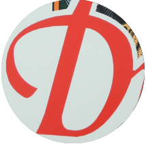
This logo is an international smorgasbord: a Greek restaurant making Italian pizza with a wordmark rooted in Swedish calligraphy. From the beautiful windmill swashes of the capital D to the 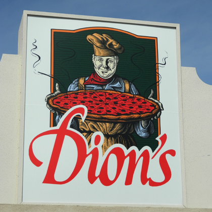 narrow letterforms, the mark is reminiscent of the Goteborg typeface, designed by Paul Shaw and Garret Boge. Shaw, who based the typeface on the lettering work of Swedish master Erik Lindegren, describes the face as a “Swedish modern italic.” Goteborg is one of three such typefaces that Shaw designed (the other two being Uppsala and Stockholm) that are collectively known as The Swedish Set. Hard core type nerds like yours truly can read more about the inspiration for this set and see early developmental drawings of the letters in this article on Shaw’s website.
None of this is to say that the Dion’s logo is actually set in Goteborg. It’s similar, but a bit bolder. I’d guess this is a custom lettering job, and a handsome one at that.
But all this typing has made me hungry. I wonder if Dion’s could whip up a Sicilian pizza with Swedish meatballs and Greek olives?
2:14 pm
Hi there! Thank you for this neat look at our logo and for the shout-out. I had no idea that we also have some Swedish influence.