Kellys Kicks on Route 66

Some of my favorite graphic design taps into easily recognizable cultural elements that give an identity context, or at least a point of reference. Kellys Brew Pub, housed in the former Jones Motor Company building on historic Route 66, has chosen to honor the legacy of the location with a nostalgic nod to a recognizable roadside sight.
A Star is Born
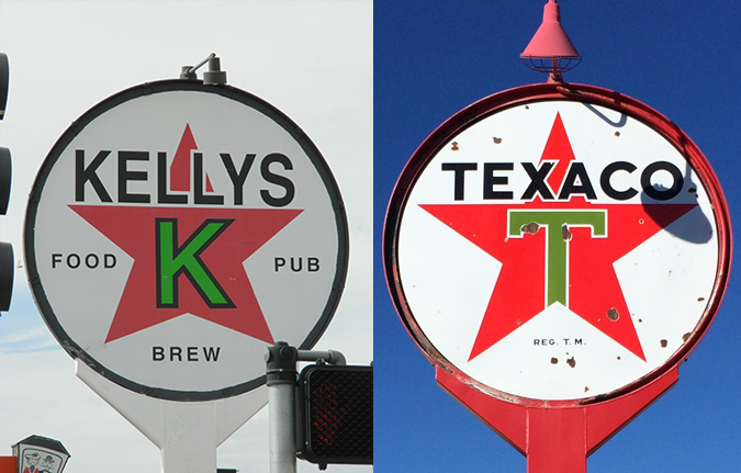
The Kellys sign draws its inspiration from the old familiar the Texaco station. Signs heralding Texaco (an abbreviation for the Texas Company) adorned American roadways, and like many Texas-affiliated organizations, featured the Lone Star in its mark. In 1909, a complementary green “T” was superimposed on the red star, and a few years later, the Texaco wordmark was also superimposed across the top. The wordmark was rendered in a variety of ever-changing sans serif styles, ranging from grotesk to geometric to even a somewhat flared-serif. (Brand standards, then as now, can be difficult to enforce.)
I really have to admire the historical integrity that Kellys employs in its signage. Since Jones was a Texaco station, Kellys honored that legacy when it took over the property. The Kellys sign faithfully replicates the red-star-in-a-circle and substitutes its own Kelly-green K for the Texaco T. The final touch is the addition of the words FOOD, PUB and BREW in letterspaced caps.
Oh Helvetica
The only place Kellys may have missed the historical accuracy mark is in the choice of Helvetica for the type. Don’t get me wrong, I’m a Helvetica fanboy. I have the t-shirt. (Ask my friends, they’ll tell you.) But if you are trying to evoke the era and sensibility of the art-deco 1940s, then maybe a modernist typeface from 1957 isn’t the most historically accurate choice. I’d love to see what this treatment would have looked like with a more streamlined sans typeface like William Dwiggins’ Metroblack or even a simple Futura. But you get the idea.
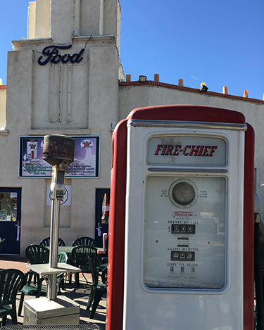
Kellys doesn’t stop here. Jones Motor Company was also a Ford dealership, and a tip to the familiar Ford logo can be found in the Spencerian-scripted FOOD sign mounted above the entrance to Kellys. Vintage gas pumps on the patio complete the ambiance of a mid-century gas station.
Basing your graphic identity on the equity of another famous – albeit unrelated – brand is risky business, and I normally wouldn’t encourage this practice. But given the provenance of the building, and the fact that Kellys has done so with a modicum of respectful nostalgia, I’d have to say that I can trust a bar with the sign that bears the star.

