
Mac’s: How I Learned to Stop Worrying and Love the Dom

Although I was born in Albuquerque, my military family moved around quite a bit for the first few years of my life. We returned to Albuquerque for good when I was five, and that’s probably when I started forming lasting memories of my hometown.
On a sergeant’s pay, we didn’t go out to dinner much, so when we did it was kind of a big deal. I can count on one hand the number of times we went to a “sit-down” restaurant, so dining out usually meant a trip to my parents’ favorite drive-in restaurant: Mac’s Steak in the Rough.
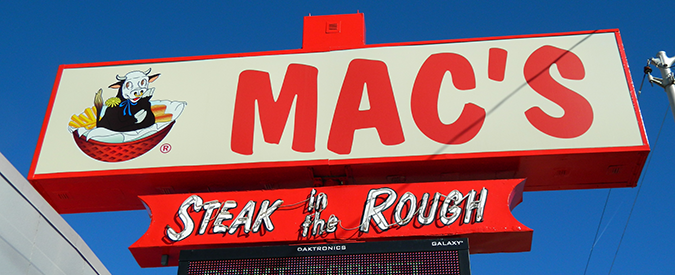
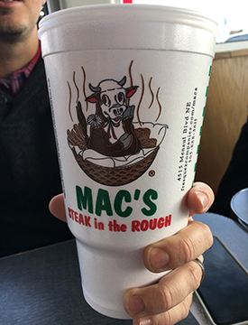
Mac’s logotype is set all caps in Dom Casual Bold while “Steak in the Rough” is set in its italic counterpart Dom Diagonal.
Steak Has Fingers?
If you’re not familiar with Mac’s, then you must not be from around here. The signature fare is a box (or basket) meal of breaded steak fingers, gravy, fries, cole slaw, a hot roll and a green onion. Mac’s played an important role in my life. It was my first taste of guacamole. It was my first experience with a taquito. And it was how I learned that meat came from animals.
Mac’s logo has not changed in decades. As long as I can remember, the logo has always been a contented cow casually resting in a basket with a steaming side of fries. In my first half-decade on Earth, I had not yet worked out the cow=beef equation. So one day as I was gobbling down my Taquita Tusum®, I asked one of those questions typical of a curious pre-schooler.
Why is this cow so casual? Is she unaware of her fate?
“Why is there a cow in the basket?”
My dad, never one to smooth the edges off of a jagged truth, told me why. He explained how steak came from cows. So did hamburger. Furthermore, pork chops and bacon came from pigs, and chicken came from, well… chicken. (Admittedly, I should have already worked that one out myself.) I don’t remember if I was momentarily horrified or just bemused by these revelations, but I do remember this moment as being my introduction to the concept of livestock. It certainly explained all those cattle drives on Bonanza.
Casual Dining
But even as I was okay with the idea of being a junior carnivore, I had some serious concerns about that basket-dwelling cow. Why was she in there? And if she was going to be eaten, why was she so happy? That cow had me terribly confused.
I don’t know if the Mac’s cow has a name, so I’m calling her Casual Cow. Not only for her devil-may-care chin-on-hoof pose, but because of the Mac’s typeface – Dom Casual.
Dom Casual was originally created by the master lettering artist Peter Dombrezian. In the interwar years, craftsmen like Dombrezian were in high demand. Much valued for their pen- and brushwork, they were frequently called upon to create beautiful hand lettering for advertising headlines. Dombrezian was especially skilled at creating letters that evoked the loose brushstrokes of a veteran sign painter. His style proved to be so popular that in the late 1940s, he created a series of typefaces (Twixt, Husky and Darky) for Photo-Lettering Inc., a display typesetting company that serviced the ad agencies of New York. In 1951, Twixt was reworked and cut as a metal type by American Type Founders in 1951 and rechristened Dom Casual.
Since its mid-century release, Dom Casual has become one of the most popular faces on 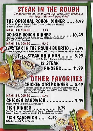 the American typescape. (Though there is also a Cyrillic version.) Its lively rhythm and casual flair lends itself well to all manner of print and electronic usages. Dom’s loose, carefree look was well-suited to the credits and titles of comedic TV fare like Bewitched and Barney Miller. Because of its friendly familiarity and perky personality, Dom’s popularity continues today, as evidenced by its long association with Mac’s.
Mac’s started out in Artesia, N.M., in 1949, right around the same time that Dom Casual was being developed as a display typeface. In addition to the logotype, Mac’s uses Dom pretty liberally in its other collateral as well, such as its menus. That’s a heavy workload for a typeface originally designed for headlines, but Dom is pretty casual about it.
Dom and Dommer
Dom is one of those typefaces that was nearly doomed by its own ubiquity. But it is now finding new life by virtue of its mid-century modern coolness. Some of the more hipster-ish designers among us, (you know, the ones who are buying vinyl records, brewing craft beer and wearing fedoras) seem to be digging on its cool vibe and giving it another day in the sun. (If Tony Bennett were a typeface, he’d be Dom Casual.) But Dom can be a tricky type to work with and extra care needs to be given to the uneven letterspacing to preserve that expert sign-painterly look. There’s something unsettling about lettering that looks like it was “hand crafted” by a robot. Kind of like an oblivious cow sitting in a basket.
1:34 pm
Thanks for this, as the grand daughter of the founder of Mac’s, this was a very cool piece to read. I’m thankful you enjoyed your Taquita’s, guacamole and especially, Steak in the Rough.
7:50 pm
Thanks for visiting Alphaquerque! I’m glad you enjoyed the article.
I’m still a Mac’s fan after 50-odd years of SITR and Taquita Tusums.
5:55 pm
When I was in High School at Sandia my friends and I used to cruise between Macs, Vips Big Boy and one other place called the steel triangle. I used to like their Taco Burgers.